How To Pick Fonts That Pop
/It seems like popular websites recently got the same memo. Compare these articles on grantland.com and thedailybeast.com. Notice anything similar? The fonts! They have style that pops.
How can the text on a page pop? That's too deep a question for me. But this guy Butterick sure knows his stuff. Go spend 5 or 10 minutes surfing his website. You'll never have more fun with typography, I promise.

Fonts inspired this guy to spend 140 hours on an animated history of typography. Almost 1 million views. Wow.
In this textual realm, font choice is as much science as art. For publishers (whether traditional or artisanal), picking the font for a book's text can be a subtle and powerful signal of what a reader holds in his or her hands. The font sets the mood and is a book's second most important visual cue, after the cover.
So which font should go in your book? Not some default like Times New Roman, that's for sure. A few experts agree that Garamond, Minion, and Janson work just fine. (Pro book designer Joel Friedlander talks about it here, and check out this other good overview.)
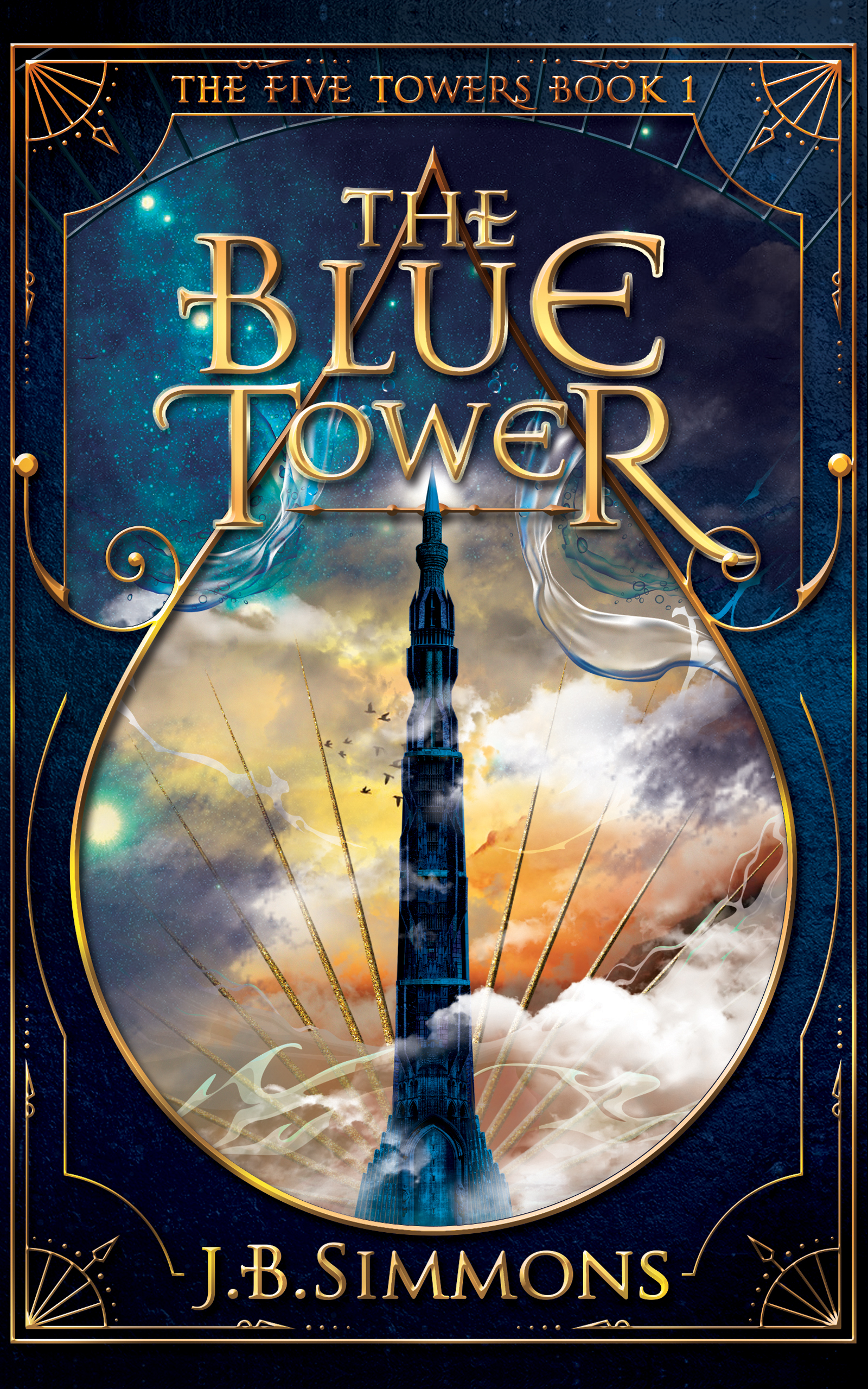
I went with Garamond in my first two books, paired with Tagettes for script-like chapter headings. See, the books aren't just Garamond. They're Garamond with some flare. Pairings matter. This leads to...


This "web font combinations" site is as exciting as it gets with fonts. For my new YA trilogy, I'm using Garamond for the text, paired with Bebas Neue. This website is Meta with Minion Pro. Such choices are part of the joy of artisanal publishing.
I'd love to hear your take. Which fonts pop for you? Baskerville? Garamond? Sometimes it's the little things that matter.
Make your fonts count -- J.B.